About danpolant.com
- Home /
- Articles
It can be hard to put a "portfolio" together for a software/web developer. In my case, I've done most of my projects with agencies, so I can't fill the site with case studies or client testimonials. For me, the purpose of this site is to show people the things that I like to work on and create.
One thing you'll notice: it's not all about work. There's big sections of the site dedicated to LEGO creations, and things I've built in crafting/survival video games. There is a common theme though - I like to build something, and then tell its story. I find this helps me make sense of life. It's as much for myself as an audience as it is for potential employers.
This site itself is another example of a "built thing," so just like the LEGO and video game builds, I'll tell you how it was built and some of the story behind it.
Tech stack for this site
When building a portfolio-type site, you usually want to keep it simple. However, I've had a bit of time on my hands recently, so I was able to tackle some more challenging issues.
Sanity and Contentful
I knew I wanted to combine content from a couple of my existing hobby sites into this one. I have a Contentful instance that houses the LEGO content. This feeds an old Material UI site that I built in 2018. Also, I have a Sanity instance that feeds content to a gamer/techie blog that I built in 2020.
This all presented some inconvenience. First, it meant that I would have to have common components that could render content coming from either Contentful, or Sanity. Each of these uses a different format for "rich" content. In Contentful, I built pages out of stacks of entries on a reference field, whereas in Sanity, I used their proprietary Portable Text field type.
Another tricky thing was images. Contentful and Sanity both have their ways of building image urls.
There wasn't a silver bullet for this. I just had to be organized about separating preprocessing code out into functions or wrapping components, and then having "dumb" components that could be fed commonly formatted values.
Fortunately, I was able to steal some of the harder bits like rich-text processing from my other sites, which are also done in React.
Next.js 14 and Vercel
Before this, I had been using GatsbyJS for my hobby sites. I worked with Next.js a lot at PerfectRec though, and I wanted explore how server/client components work in the new version (14 at the time).
The good thing about Next is that it deploys much faster than a full Gatsby build, since I do on-demand static generation. Vercel has been good to work with, although like a lot of serverless platforms, it seems like you're always being warned about how some resource usage or other is edging you towards the next payment tier. Next/image "optimization" is a bad culprit here. I turned it off for most of the high volume image slots to save me from outgrowing the cheap tier.
Speaking of Next/Image .. I think the right word for it is "opinionated." I think mostly this is a good thing. It saves you from pitfalls like having images without a defined width/height, which can lead to layout shift and bad SEO. CMSs will tell you the native dimensions of an image almost always, which helps. Next/Image rewards having a good understanding of image best practices and how image tags work with CSS (I had a fair amount to learn, it turned out).
The big new thing with Next 14 (13 actually) is server/client components. I like the concept, though it causes some complications. You can't pass functions from server to client components, for instance. Fortunately, you can almost always work around this. Beyond that, you just have to make sure that only "use client" marked source files contain the client-only hooks, such as useState, useRef and useRouter.
Algolia
I wanted the site to have a search feature. For my old LEGO website, I used the Gatsby Elastic Lunr project. This was a pretty good lightweight solution, but it sends a lot of data to the client at once. I decided to try Algolia for this new project.
It was a fun integration but probably overkill. I set up webhooks from both Contentful and Sanity that post content updates to an API endpoint (i.e. "function") on Vercel. I had to choose a common format for the search results.
export interface SearchPayload {
  pageType:
    | "build"
    | "minecraftWorld"
    | "minecraftPlace"
    | "valheimWorld"
    | "valheimPlace";
  title: string;
  objectID: string;
  content?: string;
  createdAt?: string;
  slugs: string[];
}Using this method, it's easy to display lists of search results, even if they represent different kinds of pages.
Tailwind/Headless UI
Somone showed me Tailwind three or four years ago, and I didn't see the appeal. It looked like it would create a huge mess, and be hard to make sense of.
After using it for a while at PerfectRec, I changed my mind. Yes, you get long messy class lists, but it saves you from a whole category of problems in CSS: naming and delineating classes. Also, with React, it's easy to make reusable components, so you can avoid having too much class repetition.
This is one of my favorite kind of problems to eliminate. It reminds me of the move from Features module to "config management" in the Drupal project. It seemed scary at first - because it meant your config folder was a mess and not organized into categories - but, soon we all realized that not having to worry about naming and defining the "identity" of a group of config was a great freedom to have!
I even prefer Tailwind now over frameworks like Material UI or Grommet. With those heavier frameworks, you have to learn a whole React component API in order to do anything, and the underlying markup is obfuscated. Tailwind, on the other hand, is more like a best-practices shorthand for regular CSS. There's no markup component to Tailwind, so there are no markup black boxes.
This is all good, but for some things (like form elements or UI surfaces like modals), you may not want to spend a lot of time reinventing established patterns. Headless UI fills this role well. I use it for search autocomplete, image modals, menus, and many other things. The Headless UI site has a ton of great examples that you can modify to do the things that you need.
History
Here's a chronicle of the danpolant.com's of Christmas past:
V1
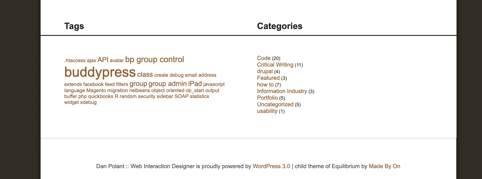
The first version of danpolant.com is completely lost to time. It was damn ugly! Archive.org didn't hang onto any of the images or css. It was a Wordpress site, and it had a homepage and some posts, and a tag cloud.
V2

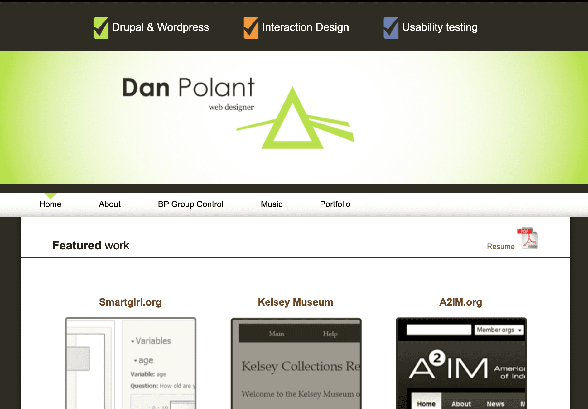
I actually like the way this turned out. Look at that gradient! Back in the day you had to do that with images. And the little menu indicator thing looks like a light!

Man I was all about the Buddypress. Somehow it still exists!
I did the design for this in a graphic design class. I'm sorta proud of it!
Thanks for reading the story behind my site!